
Jump to

Illustrations

Meltmedia
2011–2014
Meltmedia was the first place where I got paid to illustrate. I primarily created illustrations for blog articles, but also worked on marketing sites and internal initiatives like swag.

The blog illustrations were a joy to make, but typically had time constrains, so a simple flat and quick to compose style came about. This blog post was about finding the right company culture.
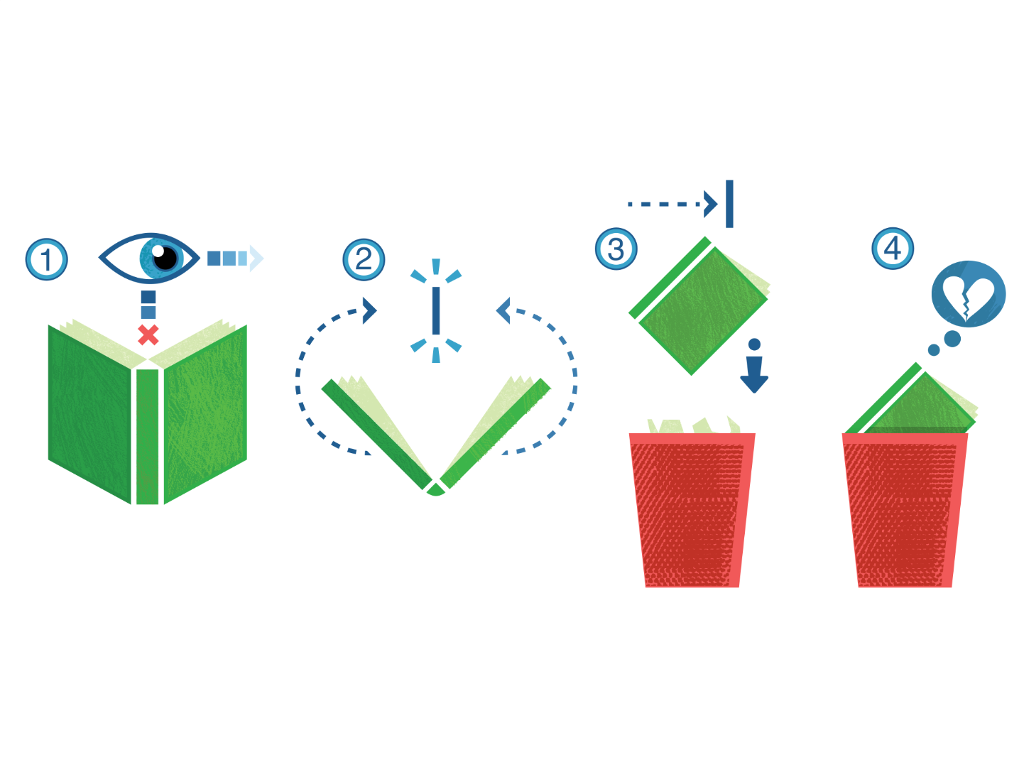
When time allowed, I experimented with adding texture and style variations. Some blog posts had a fun, whimsical tone, like this one about knowing when to give up on a bad book.
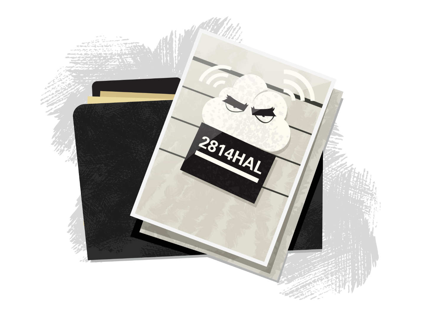
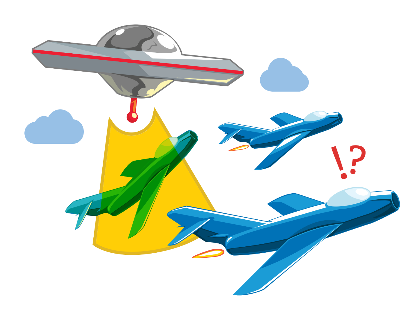
Figuring out the right metaphors was always a fun challenge. I aimed to keep them playful without straying too far from the subject. This one, for example, was about cybersecurity in the cloud.
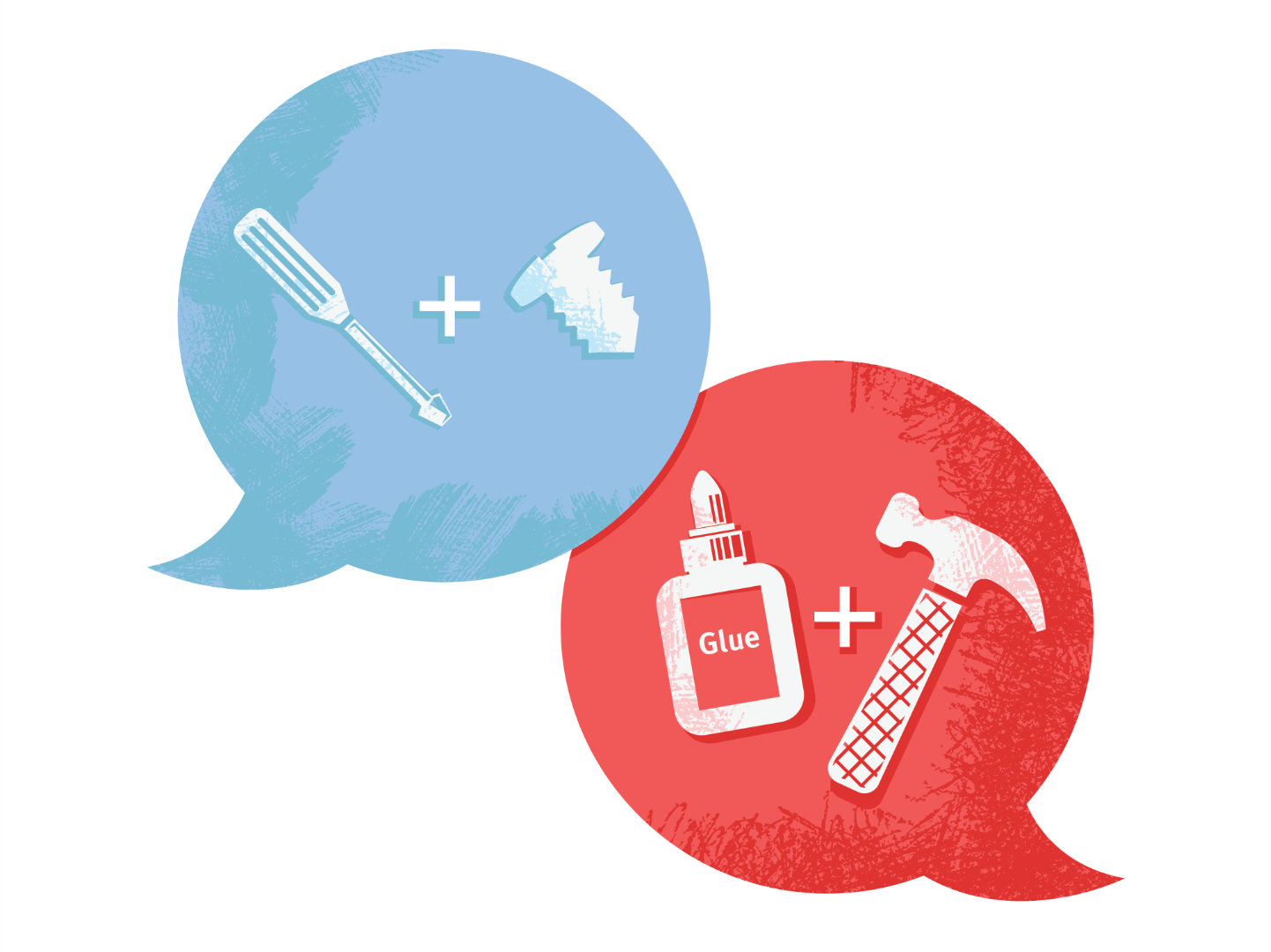
Sometimes the best solution was to keep it straightforward and simple. This blog post, for example, was about finding and using the right set of development tools for your projects.
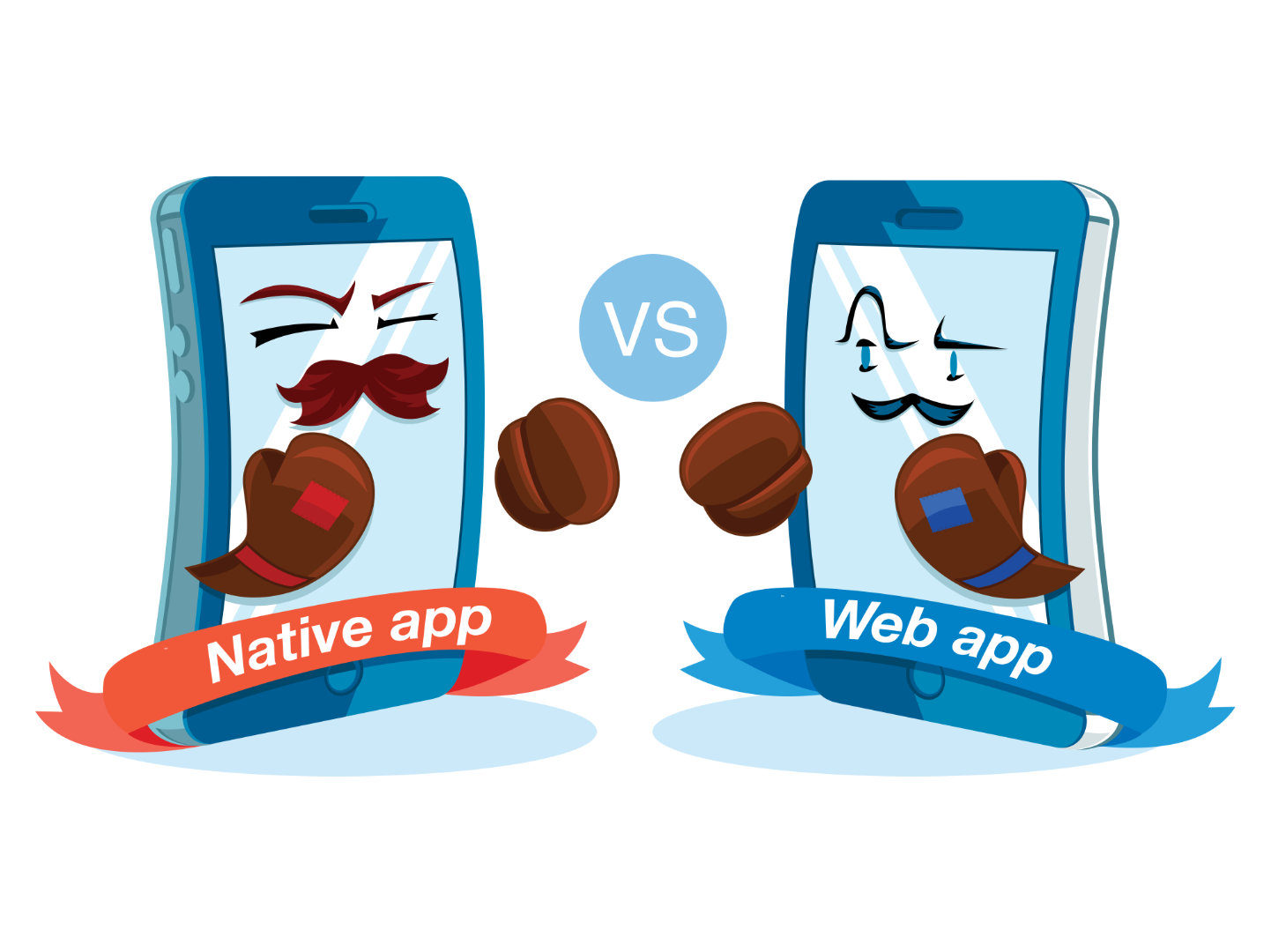
Some posts even had sequels, which gave me the chance to iterate on the illustrations. This one explored which was better: a native app (iOS & Android) or a responsive web app...
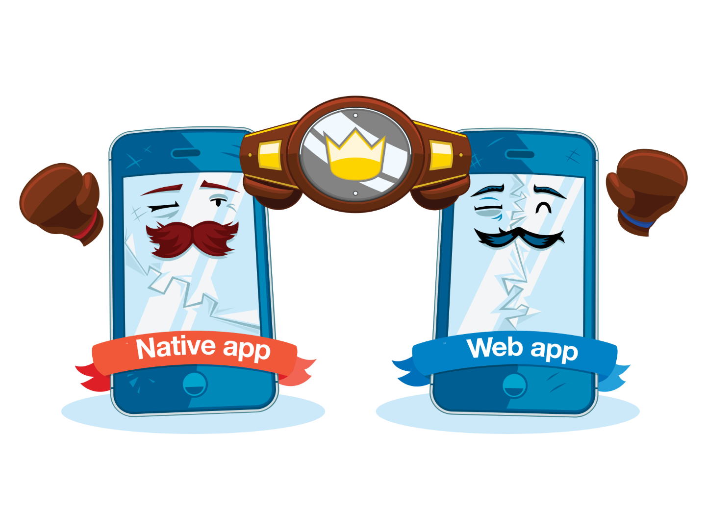
In the end, the answer was that it depends. Both native and responsive web apps can be viable options depending on the factors being considered.
Sometimes the metaphors I chose were a bit out there. In this case, the blog post explored productivity blockers and how certain tasks can hijack or severely interrupt a project’s timeline.
Outside of blog posts. I occasionally got to illustrate for the occasional swag items like shirts and sticker sheets. Sometimes Meltmedia would build a fun marketing site or pitch deck and I was able to illustrate for those as well.
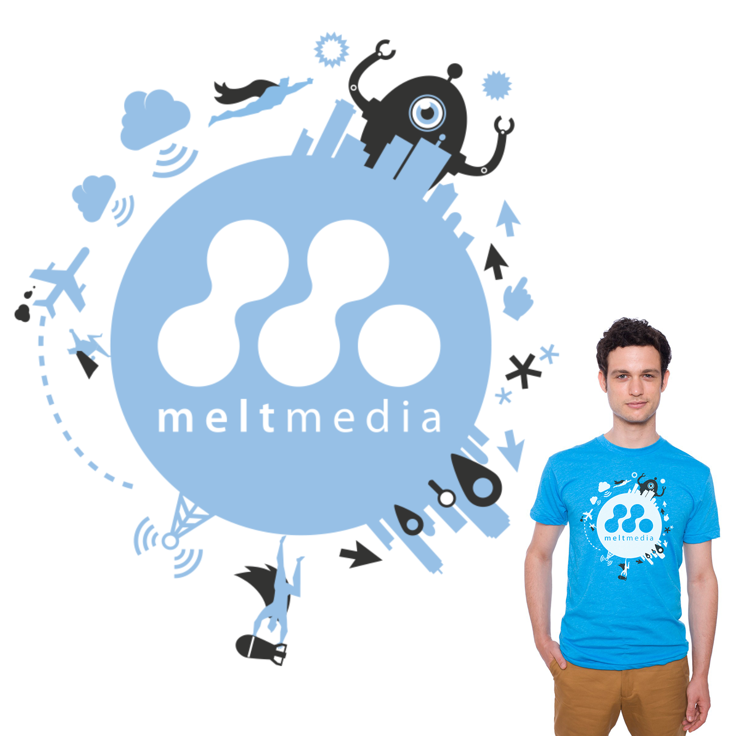
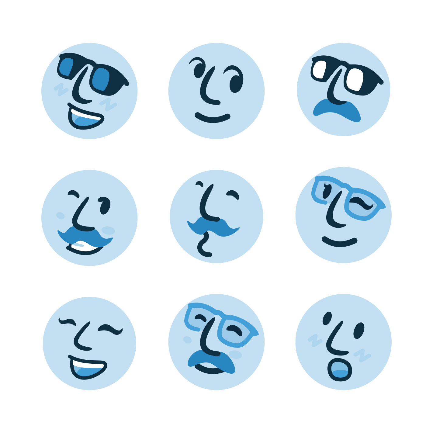
Shortly after I joined, Meltmedia adopted the tagline 'Interactive Superheroes.' I had the opportunity to (tastefully) modify the logo for items like shirts and other small swag-related products.
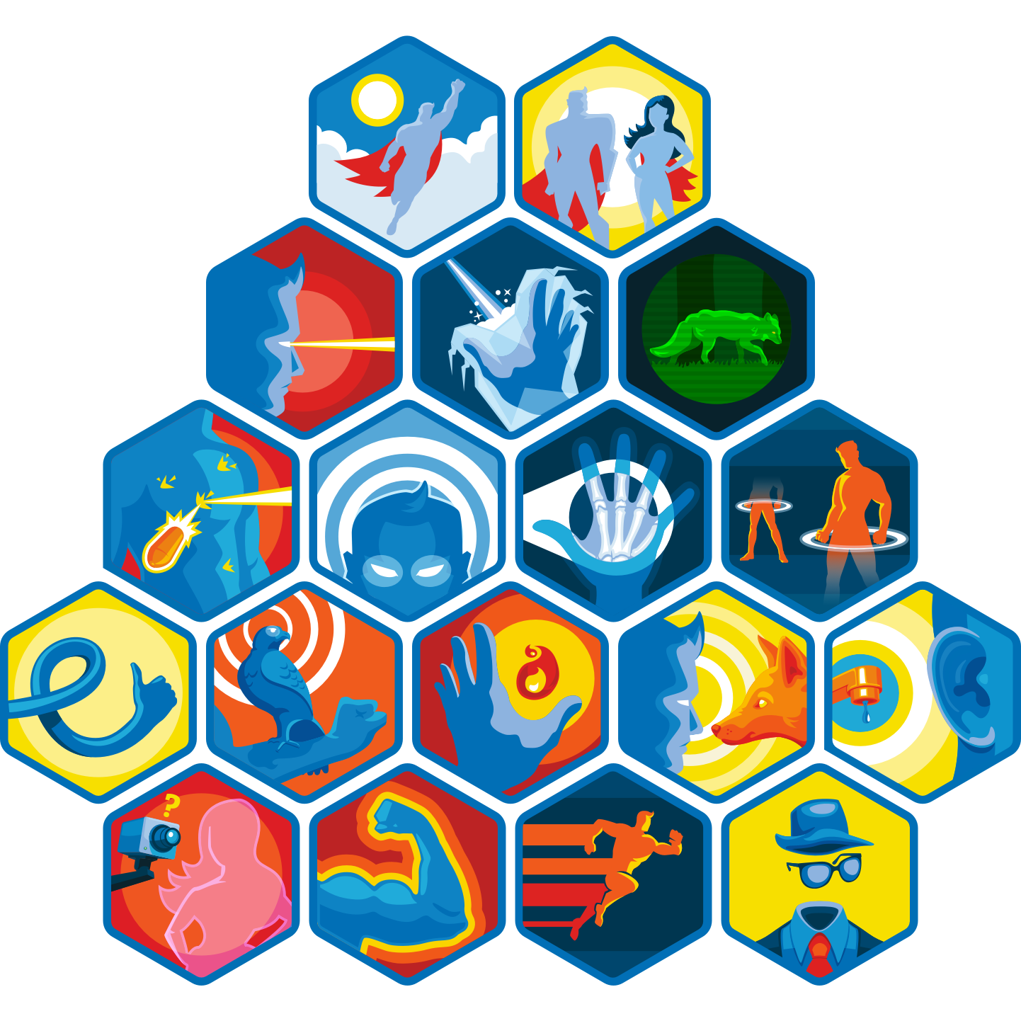
A playful microsite called super.me let users type their name to receive a superpower, but each had a quirky drawback, like flying but only in reverse. I illustrated the badges for said superpowers.
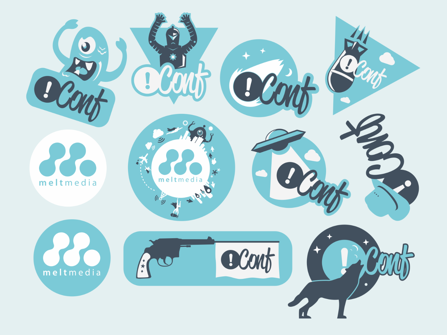
Meltmedia once organized a small development conference called Not Conf. I had the chance to create a series of illustrations for different types of swag, including this sticker sheet we produced for the event.

S.H.I.E.L.D was an internal initiative aimed at promoting continuous learning and development among the agency's staff. The hammer, lightning bolt, and goggles symbolized various cultural elements.

Guidebook
2015–2020
After my time at Meltmedia, I felt confident in promoting myself as both a designer and illustrator. At Guidebook, I continued doing both. Even after being promoted to Product Designer, I continued to contribute illustrations for the brand and its products.
When I joined Guidebook, they already had an established brand and illustration style. Over time, we refined the brand, and I had the opportunity to develop a new illustration style.
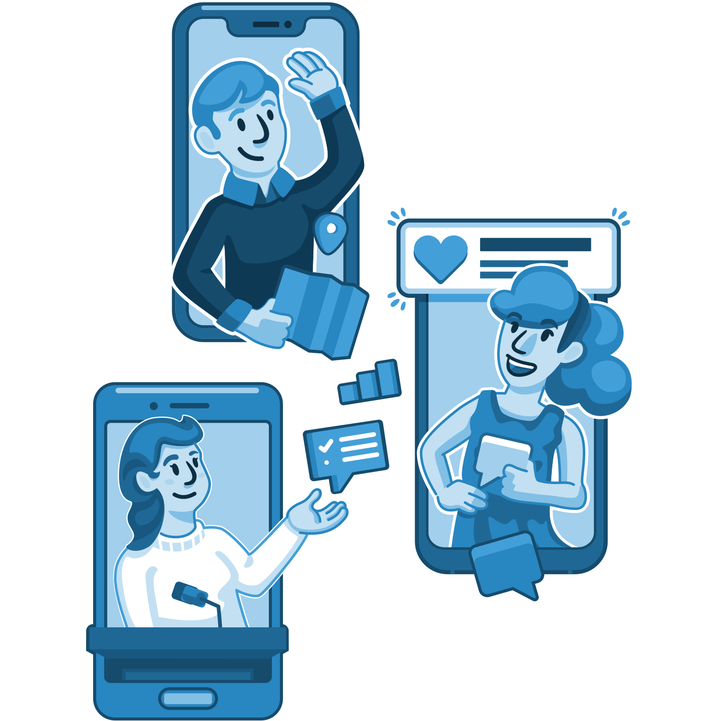
I ensured that Guidebook's charm and whimsy were preserved while introducing a more refined tone. These illustrations on the homepage were used to highlight Guidebook's key features.
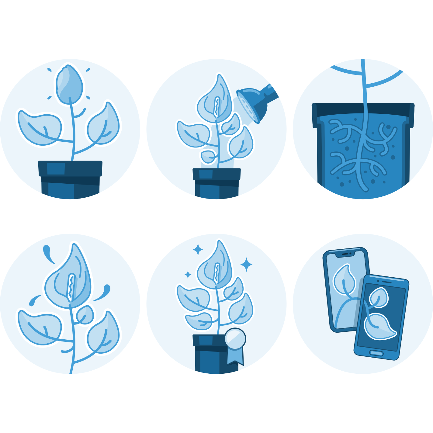
Using an all blue palette simplified and complicated the illustration process. This series of spot illustrations were used on the partnerships page, symbolizing how to grow your product.

This new style even found its way into the app as part of the new onboarding illustrations. While the visuals were mostly limited to a single color, occasional exceptions were made.
Using nested symbols in Sketch, I developed a random avatar generator intended to replace the fallback icon. Although not implemented, they were still used in marketing materials.
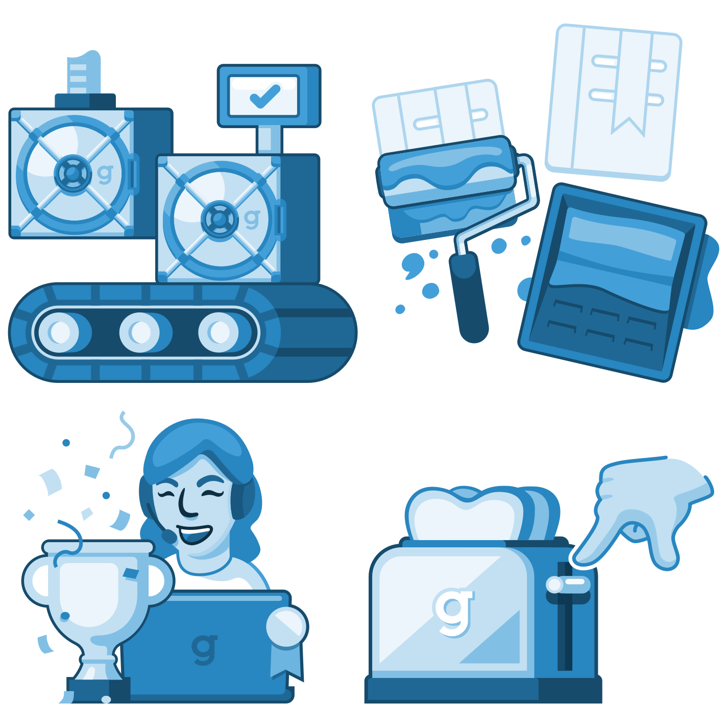
On the Builder CMS side, I also created illustrations. My goal was to establish a tactile, straightforward, and professional style. Even if it leaned a bit dry, it couldn’t compete with the Builder’s user interface.
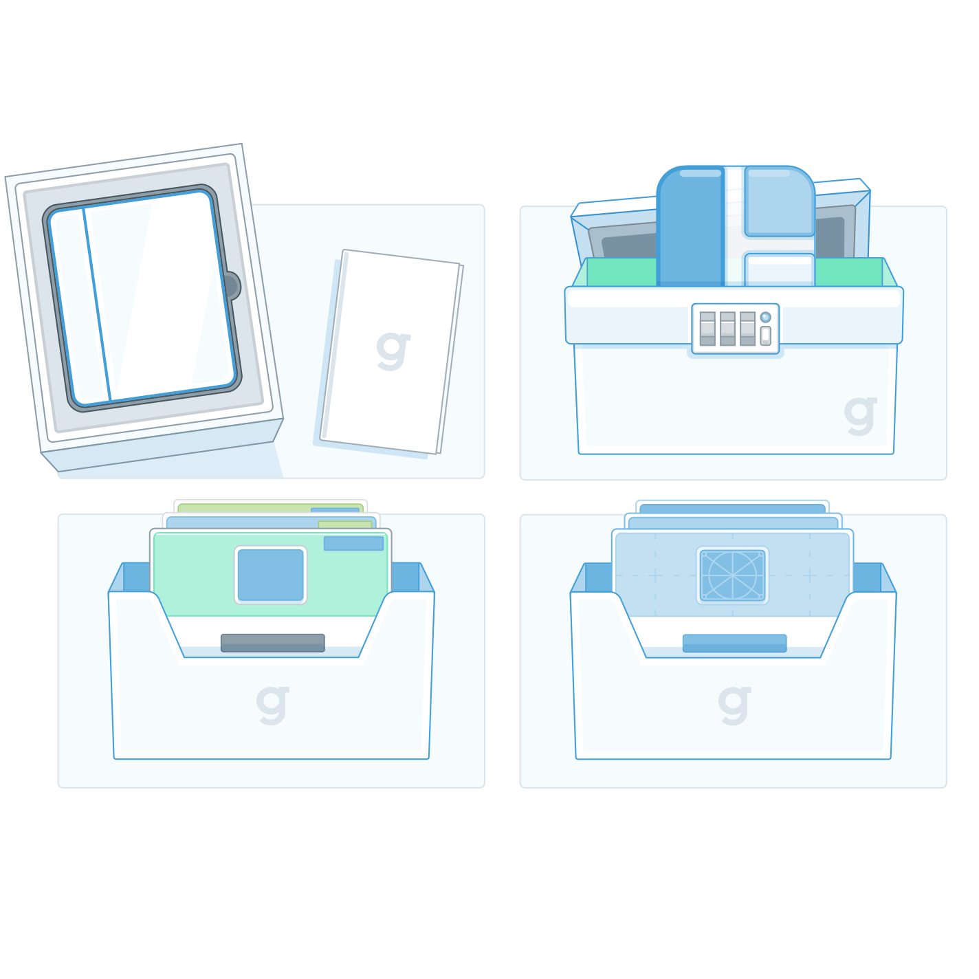
Guidebook’s products - its guides, apps, and spaces, were represented as tangible objects you could imagine holding and interacting with.
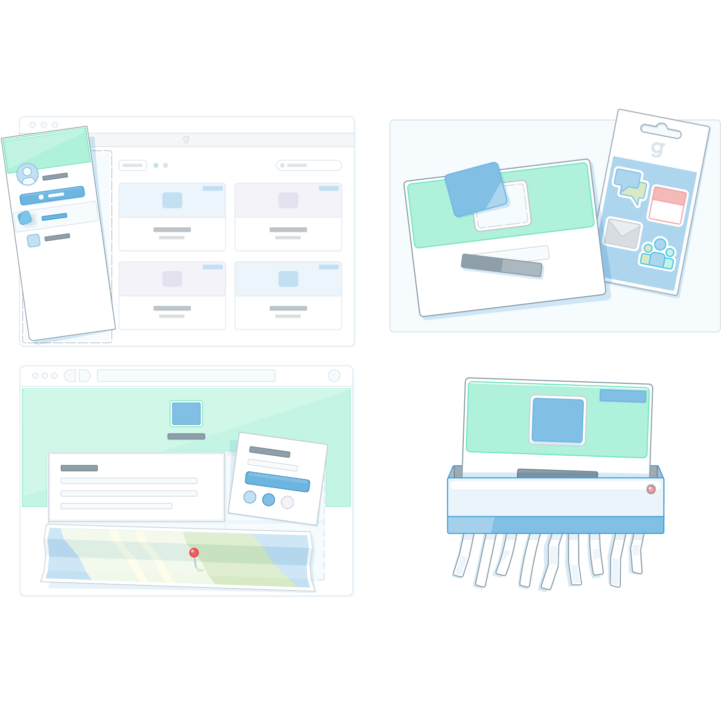
When products were shown in the context of user actions, metaphors like sticker sheets or layered paper were used to suggest physical manipulations users could perform.
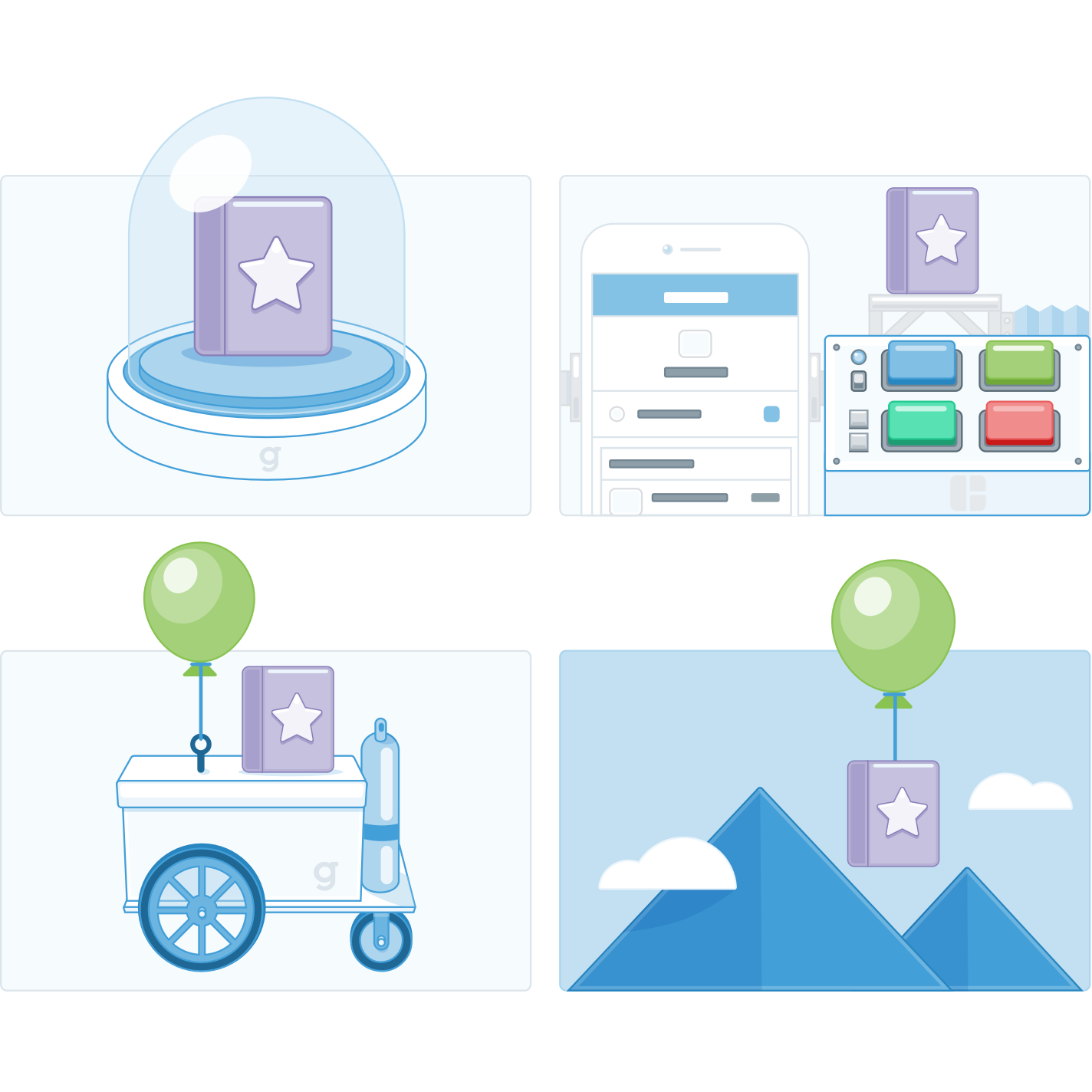
These illustrations represent the different stages a guide goes through: purchasing, branding, preparing for publication, and going live.

Not just products, but features like plug-ins, activity feeds, and security flows were also illustrated as physical objects.
As the new marketing style took hold, I planned to adapt the Builder illustrations to match. This was one of the early before/after examples.

Fun stuff outside work
It’s no secret that I love illustrating. I don’t get to do it as often as I’d like, but I still manage to put some work out there.

Originally a graphic for a NOVA kickstarter campaign, the project feel through and I adapted the graphic and put it up as a t-shirt design over at Cotton Bureau.
A friend of mine came me an idea for a t-shirt. I took the phrase and ran with it. It's also up for purchase on Cotton Bureau.
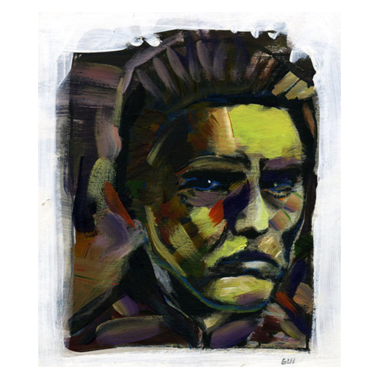
Not all my illustration work is digital. Once upon a time I used traditional mediums as part of my fine arts education.

Most recently I created this illustration for our baby shower. In this case a static graphic wasn't enough, it needed to be animated :)


