
Jump to

UI & Web

Arizona State University • UTO
2008–2011
After graduating, my first job was at Arizona State University, where I worked in the University Technology Office. I was responsible for designing webpages for the university’s largest college, the College of Liberal Arts and Sciences, and occasionally contributed to the student portal, 'my ASU.' Toward the end of my tenure, I had the opportunity to assist in redesigning the university’s homepage and its first mobile-optimized version.
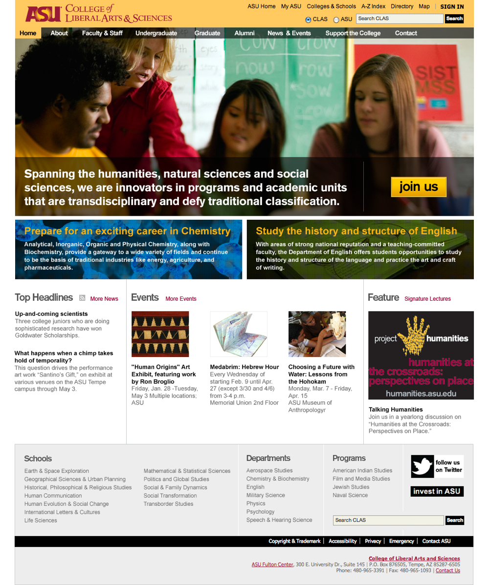
The design I made for the CLAS home page. Back then websites were typically 960px wide and breakpoints hadn't been invented yet.
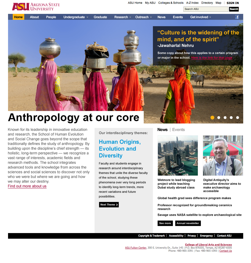
Another design for a CLAS school: Anthropology...
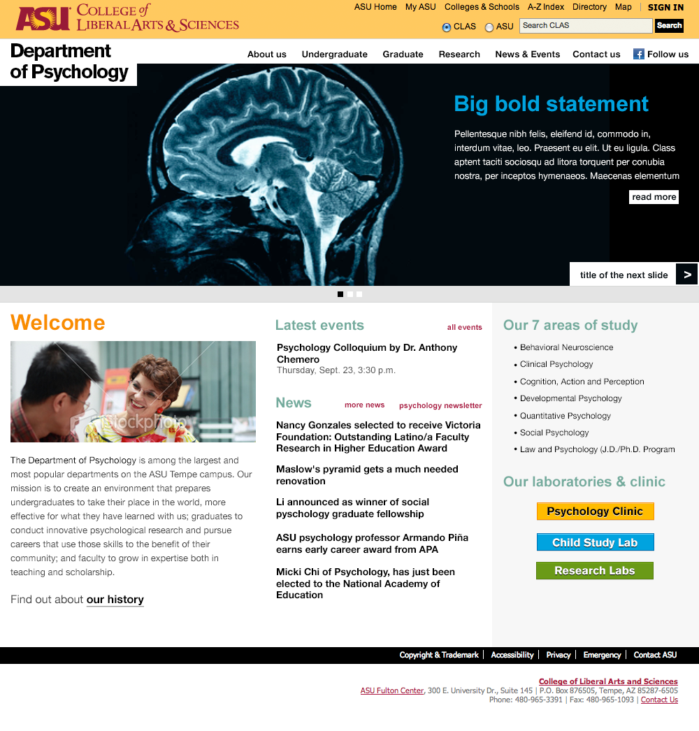
...and Psychology. A year or so during my time at ASU, the university updated their branding. There were clear guidelines for print, voice and even billboards, but the web not so much. It was a bit of a wild west and did my best to adhere to the new branding.
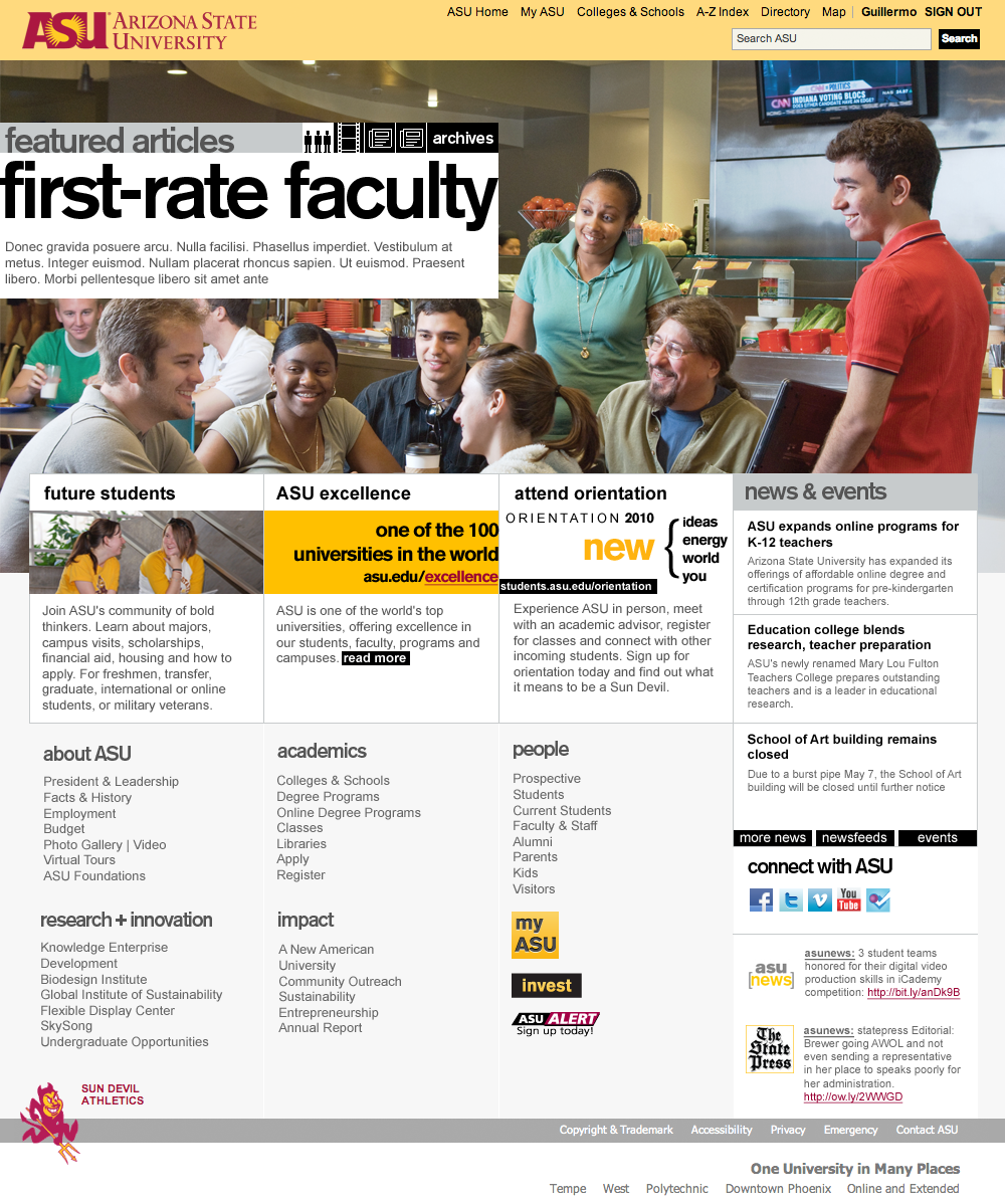
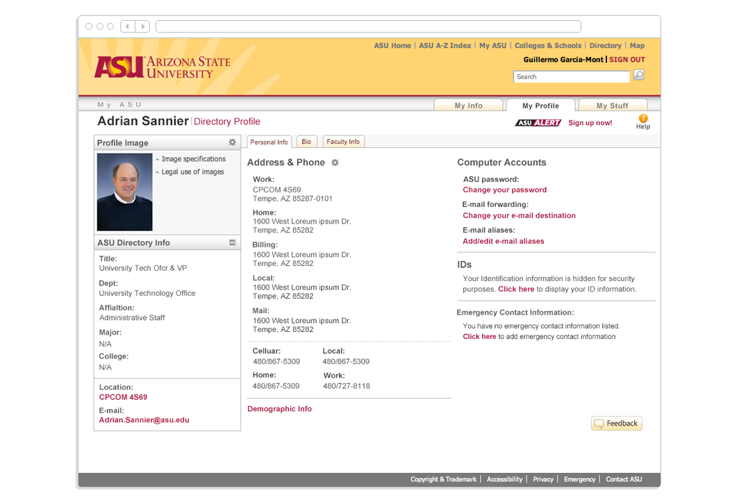
With more websites under my belt, I eventually got the opportunity to help redesign ASU’s universal header and later the homepage. This was the initial design I presented.
As smartphones gained popularity, companies began developing mobile versions of their websites. I had the opportunity to design ASU's mobile site. Eventually, responsive design became the standard, replacing the need for dedicated mobile versions.
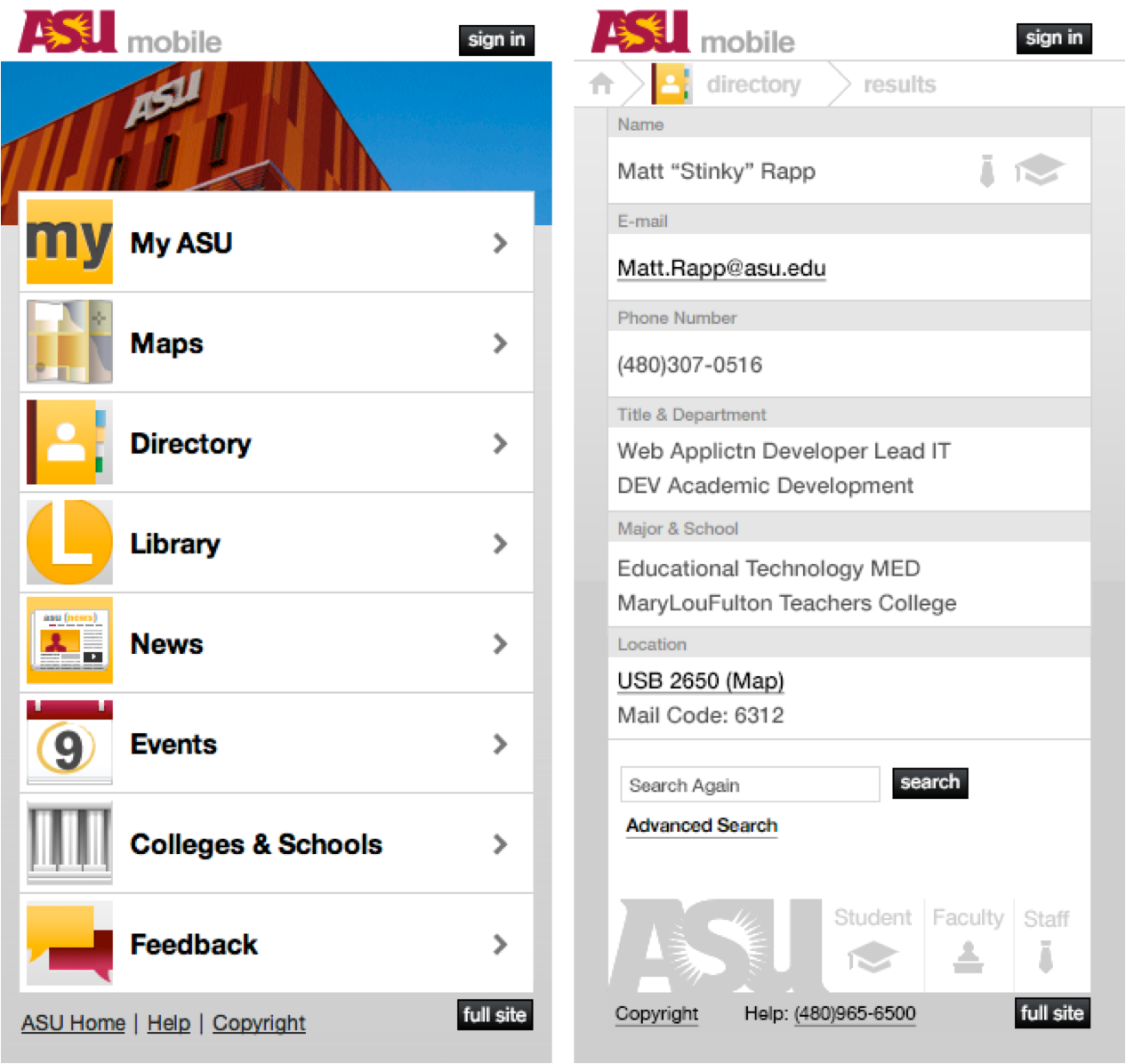
I occasionally did work for the student portal (My ASU). This is the design I put together for a directory refresh.

Meltmedia
2011–2014
Meltmedia was a small web agency and one of the early adopters of fully responsive web sites. I joined as a UI/UX designer, creating websites for clients in the medical and pharmaceutical space, including Genentech. Along the way, I also got to work on fun internal projects, from blog illustrations to marketing campaigns. Agency life gave me the chance to collaborate directly with clients and work across a wide range of industries and brands.
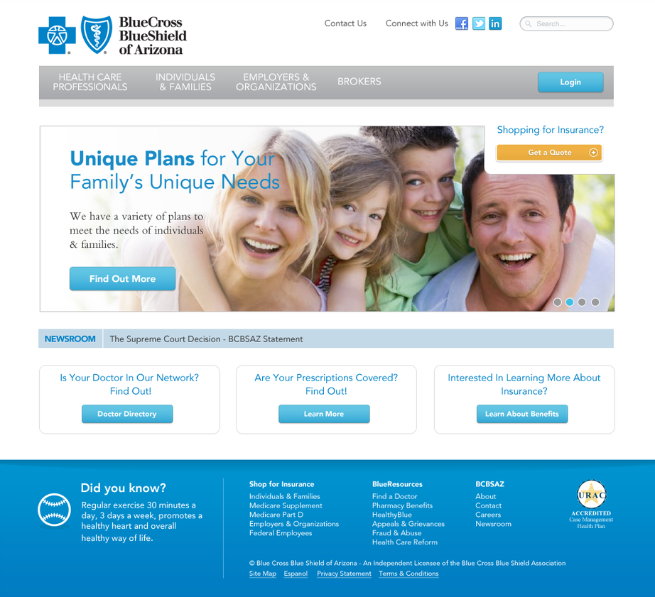
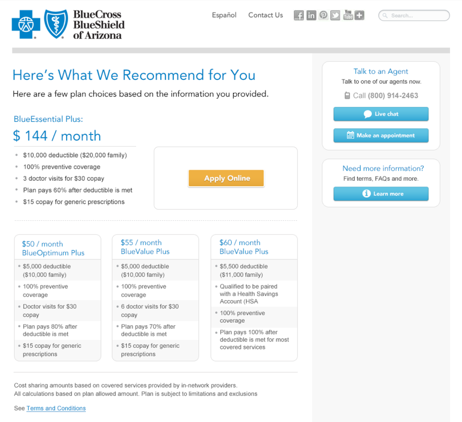
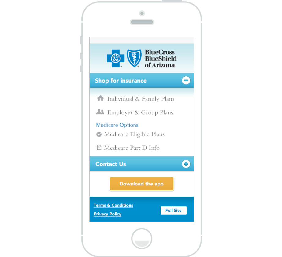
While at melt, I tipically designed sites for medical and pharmaceutical brands like Genentech, and in this case BlueCross BlueShield of Arizona.
At melt we built all our websites to be fully responsive which at the time made designing layouts new and novel.
Choosing which content to reflow or hide was always interesting as were the experiences working with clients.
FLTR (Forward Looking Tech Radar) was a fun internal project spearheaded by our head of marketing to establish Meltmedia's expertise in the tech and web industry. I got to design a one pager website full of animations and SVG iconography.

FLTRs’ layout featured a series of icons, each representing a technology or trend, arranged on a series of concentric rings. The farther an icon was from the center, the less relevant the technology.
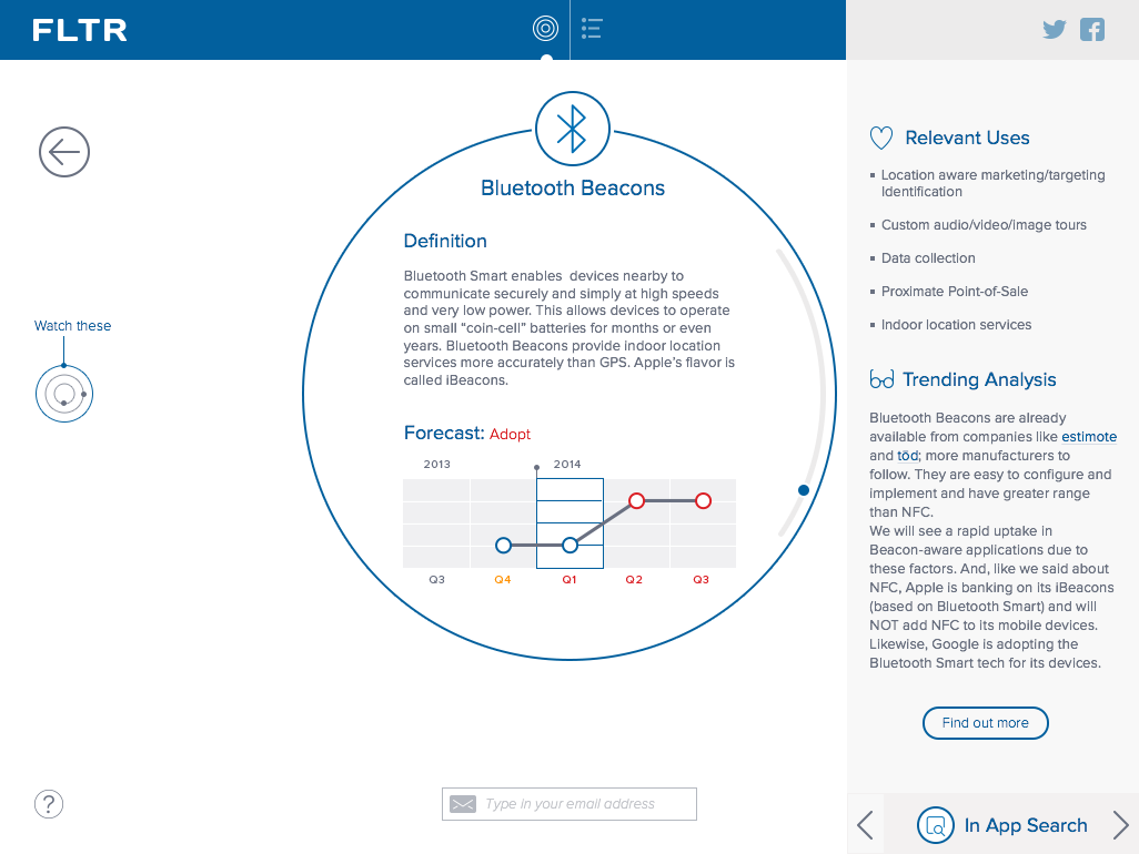
Selecting an icon would zoom in on the viewer, providing a detailed explanation of the technology they selected.
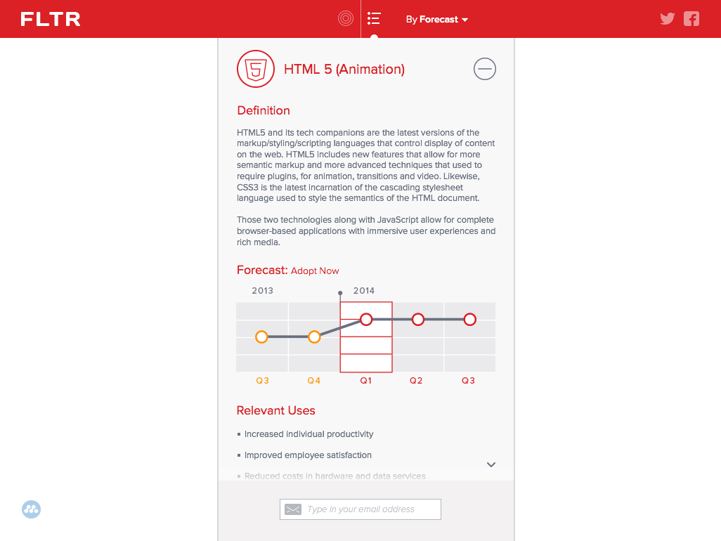
For those who wanted a more straightforward interface, the content could be viewed as list with expandable sections...
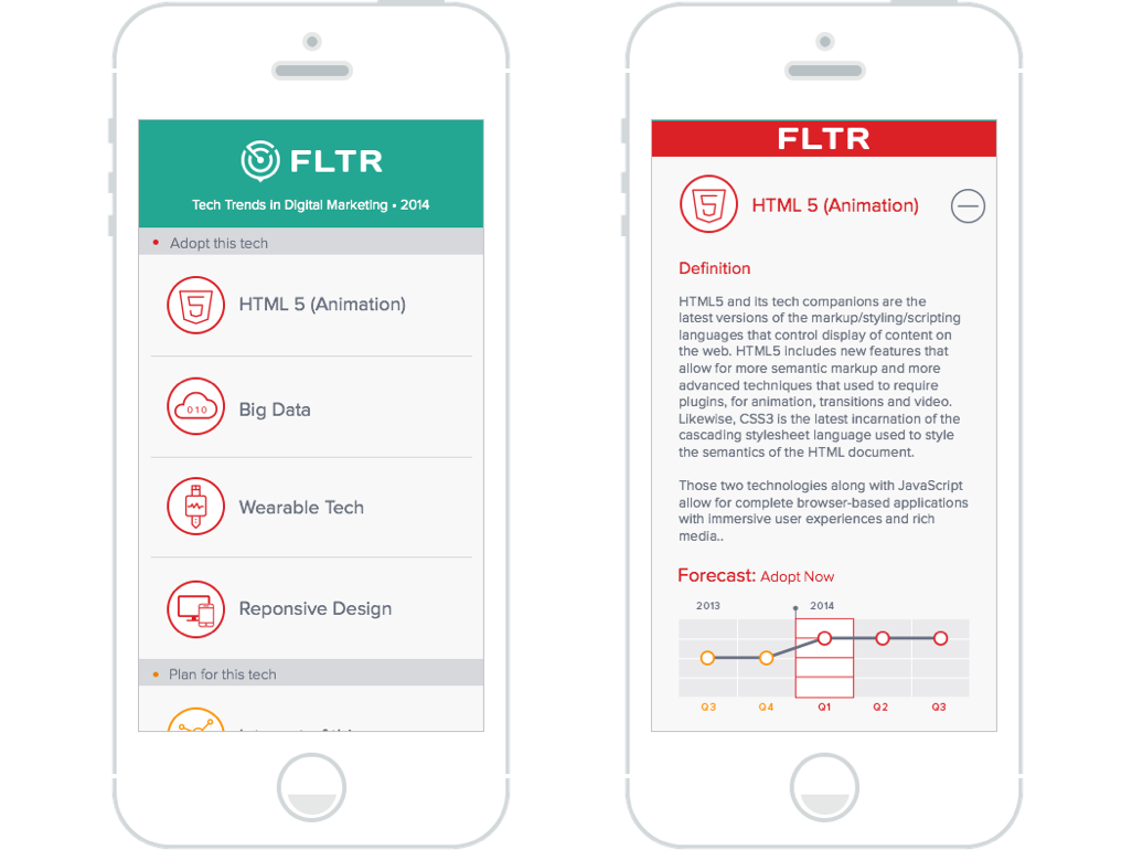
...which also happened to be the layout for the mobile break point.

Guidebook
2015–2020
I moved to San Francisco in 2014 to push myself and grow as a designer. My first year was a whirlwind: I started out at a startup called App Annie, then spent some time freelancing full time. Eventually, I joined Guidebook, where I began as a marketing visual designer and later transitioned into product design. Five and a half years later, I’d grown into a Senior Product Designer. It was an incredible run that set me up for what came next.
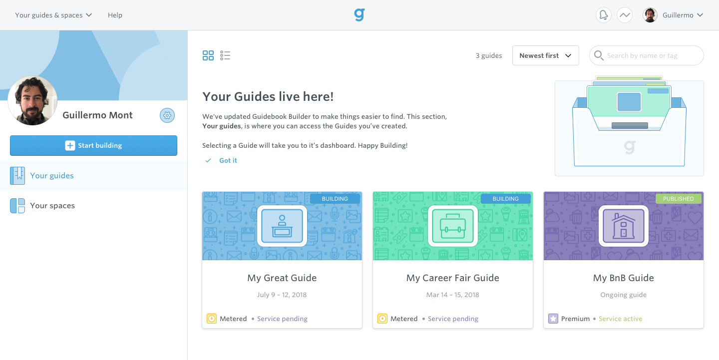
The Builder's homepage initially catered to a single customer type and focused on one product: Guides. As Guidebook expanded its offerings and customer base, the homepage evolved in complexity. I developed a straightforward and scalable design that could accommodate a broader range of products and customer types.
A typical users empty home state, here they haven’t purchased or begun building any guides.
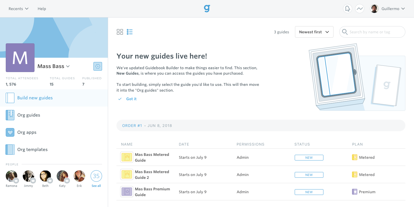
Users could manage multiple guides and access a branded space on the Guidebook app.
Guidebook supported organizations with diverse guide types and their own app instances, offering card or list views on the homepage.
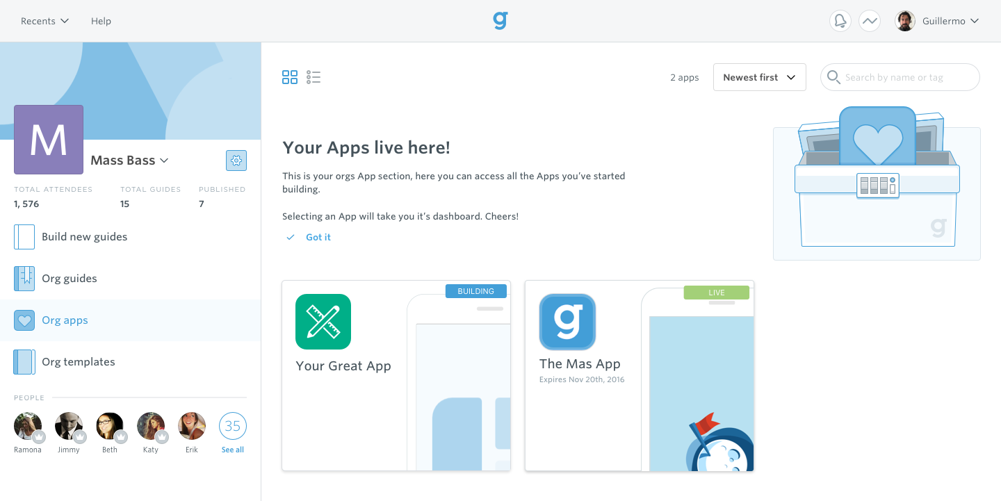
The visuals for guides and apps were also formatted differently to ensure there was never any confusion when switching product types.
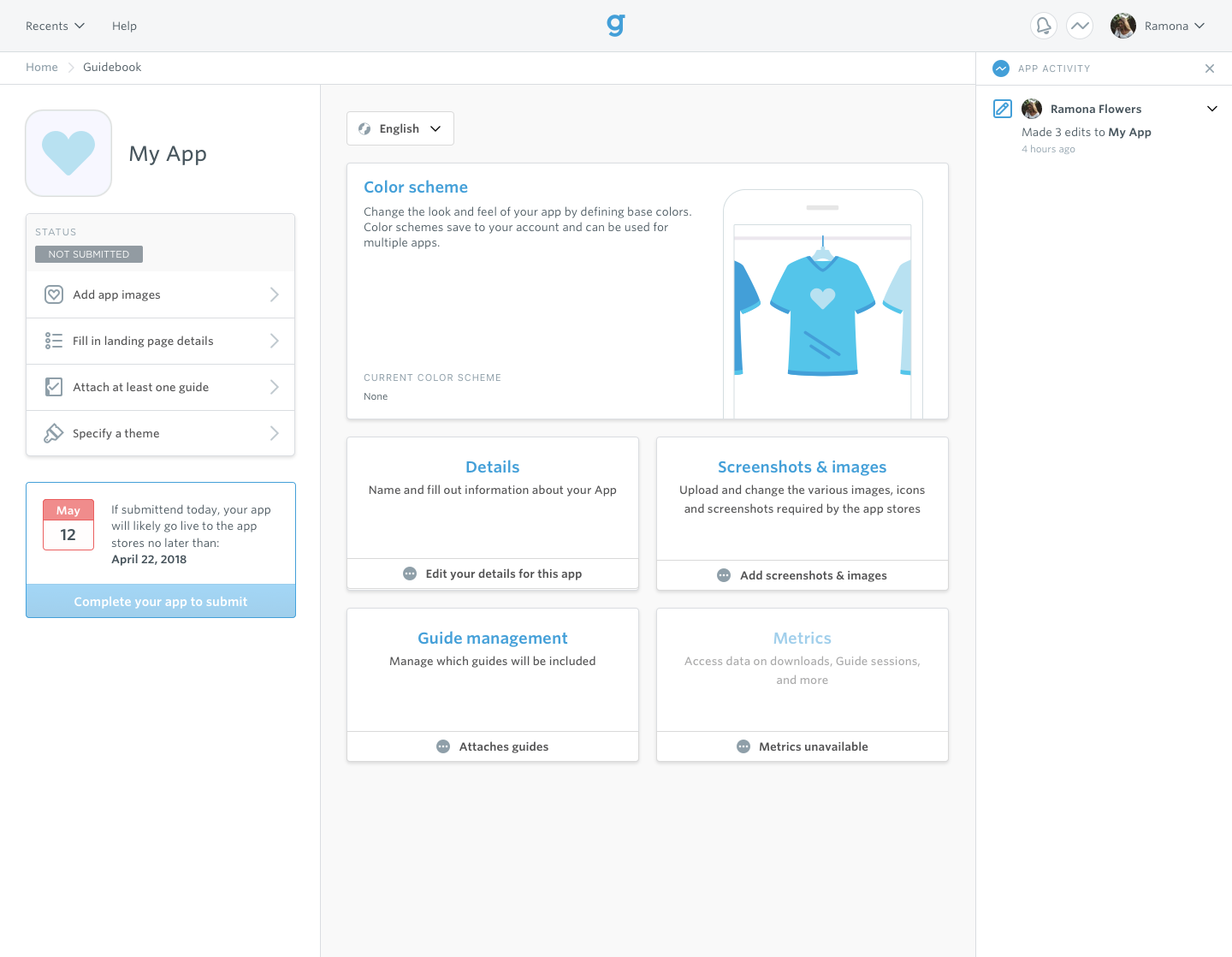
After selecting a product on the Builders homepage, the user was directed to the corresponding product dashboard. The Guide and App dashboards were thoughtfully designed, taking into account how builders used our products and the stages they’d go through when building and administering their guides.

The very beginning of a guide’s life. Here the Builder has just begun their build process and the different supporting features are de emphasized since their utility is little to none until the guide is live and end users are enjoying it.
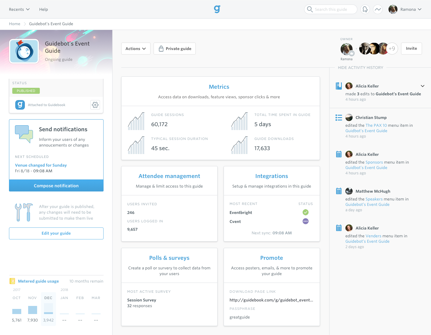
With the guide now live and its event underway, the dashboard is reflowed to help the builder monitor the event and send notifications as needed. Other helpful features are brought to the forefront as well.
On the app side, its dashboard followed a similar layout but with a checklist orientated workflow ensuring all the assets required were accounted for, thus guaranteeing a smooth deployment across Apple and Android app stores.
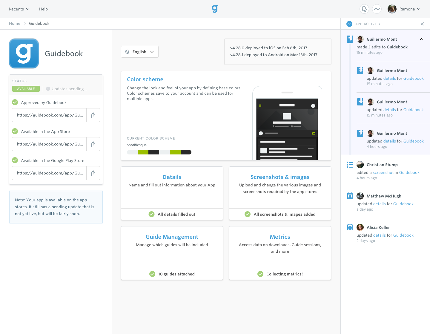
The App dashboard fully built out with the app live in the Google's and Apple's app stores, as well as to a guidebook provided promotional page.
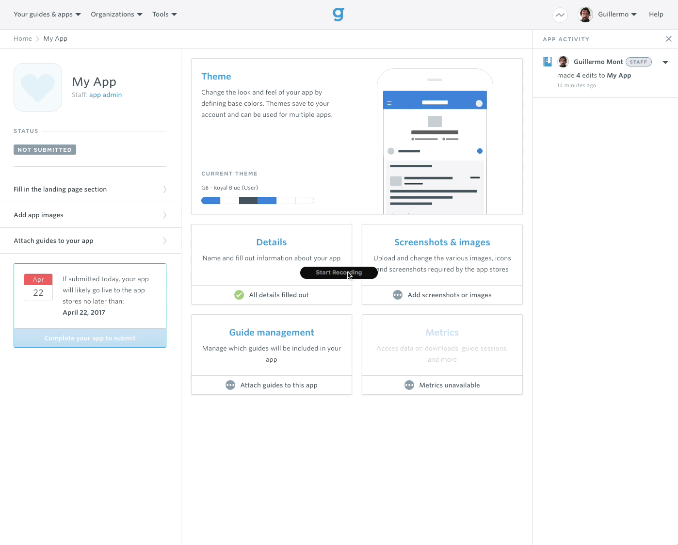
The app themer allowed users to style their apps UI to gel with their brand. Skeletal stand-ins were used to help users visualize the various screens within their app.

TILT
2023–2024
In 2020, I joined a new team within Amazon Recruiting to build a product from the ground up: Prelude. (I’ve got a full case study on it.) After its success, our team started another 0-to-1 project called TILT: Talent Intelligence Learning Tool. Built to help recruiters quickly find information about their roles and orgs. We launched a beta, but when hiring was halted, the project was cut and our team disbanded soon after. I later transferred to eero and wrapped up my time at Amazon after five years.
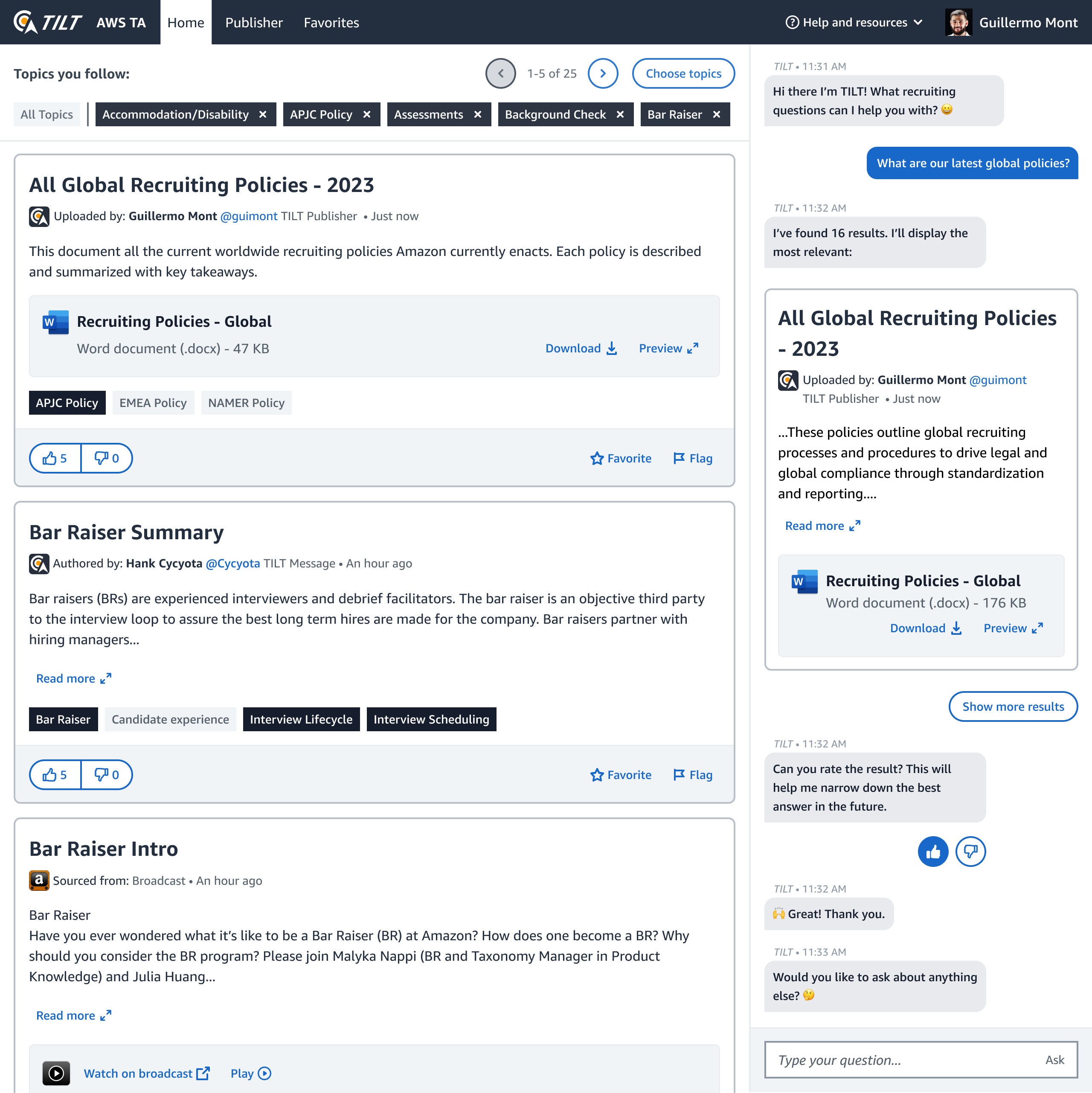
TILT was designed with two main functions, a feed filled with relevant, timely, info and a conversational search column to help users define and find the information they need.

Content can be searched for and surfaced in the side column. When selected, an expanded version of the content replaces the feed column.
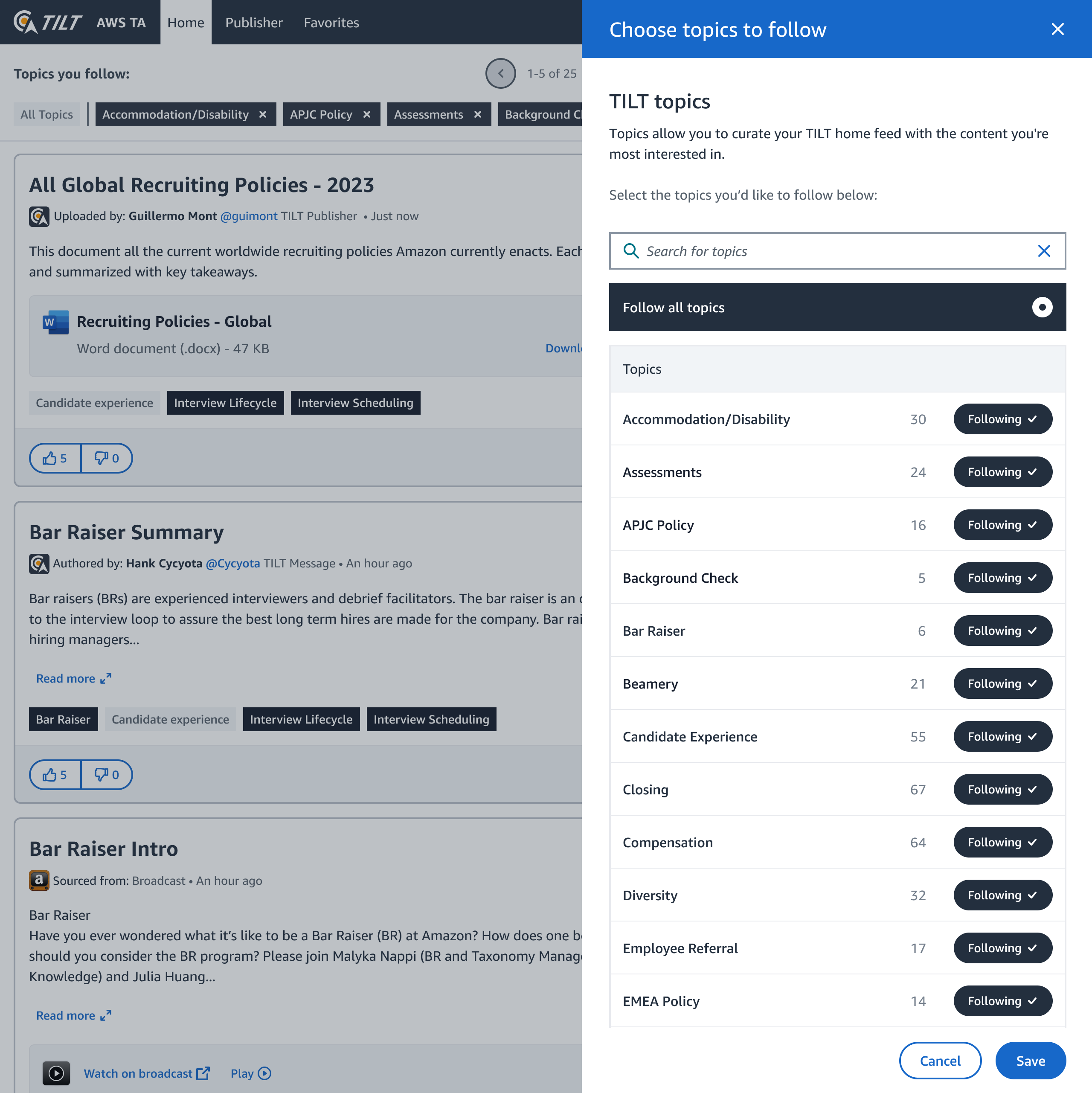
Recruiters could customize their feed by selecting which topics they wanted to follow.

We also gave admins and thought leaders within the recruiting space the ability to upload and revise content with a lightweight CMS.
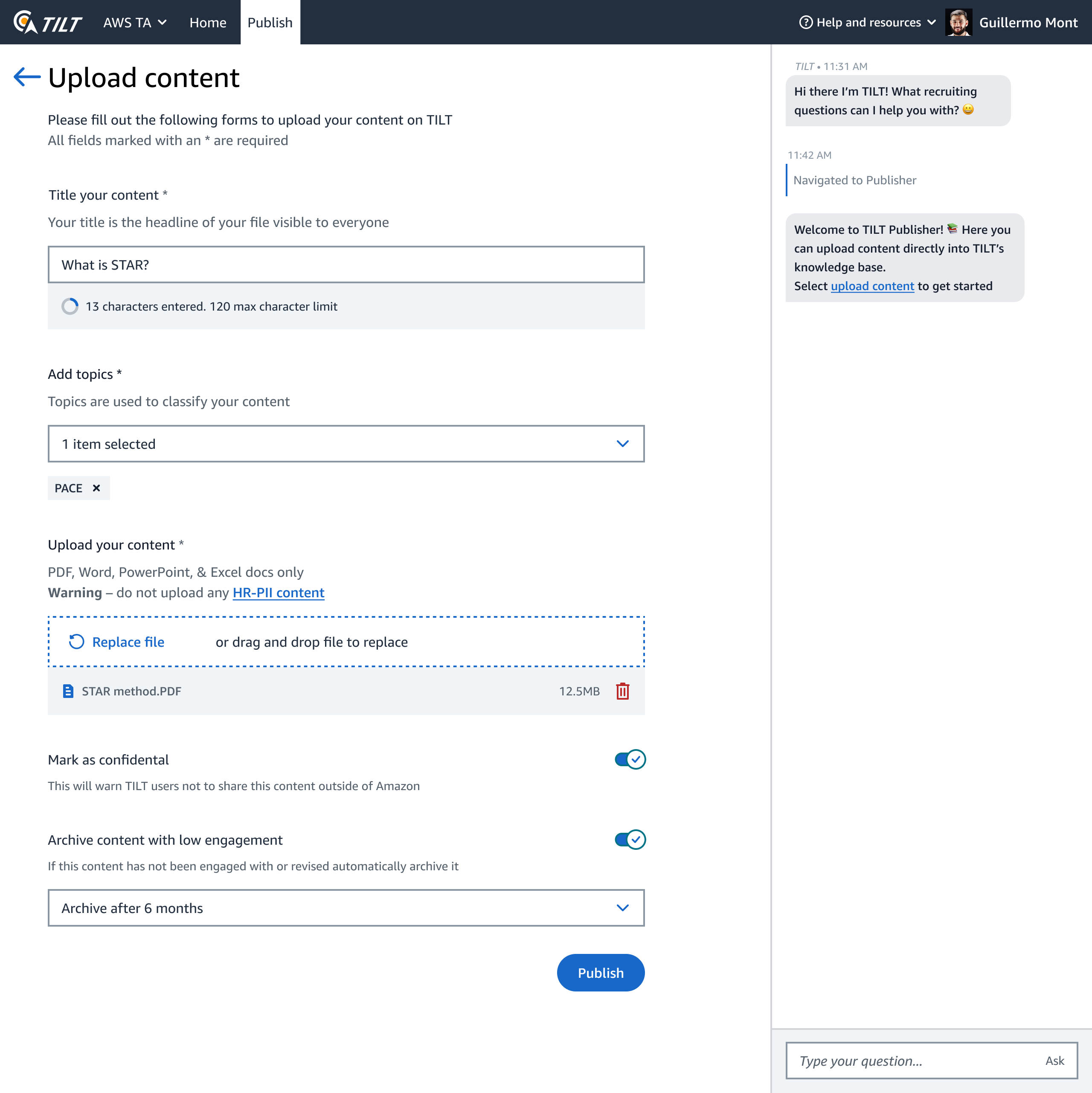
The publisher side of TILT was flexible regarding content format, accepting links, files, and videos. A future update was planned to allow users to post rich text and even polls onto TILTs feed.


