
Jump to

Icon sets

Arizona State University • UTO
2008–2011
After graduation from the University of Dayton with my Bachelor of Fine Arts, I wanted to be an illustrator. The first job I landed was at ASU as a "Graphic Design Specialist". Illustration was not part of the job description but I did manage to sneak in a custom icon here and here, and thus began my love of Iconography.

Here's a random collection of some of the icons that made their way to prod. Most were just one offs with the exception of an icon set I made for student finance.
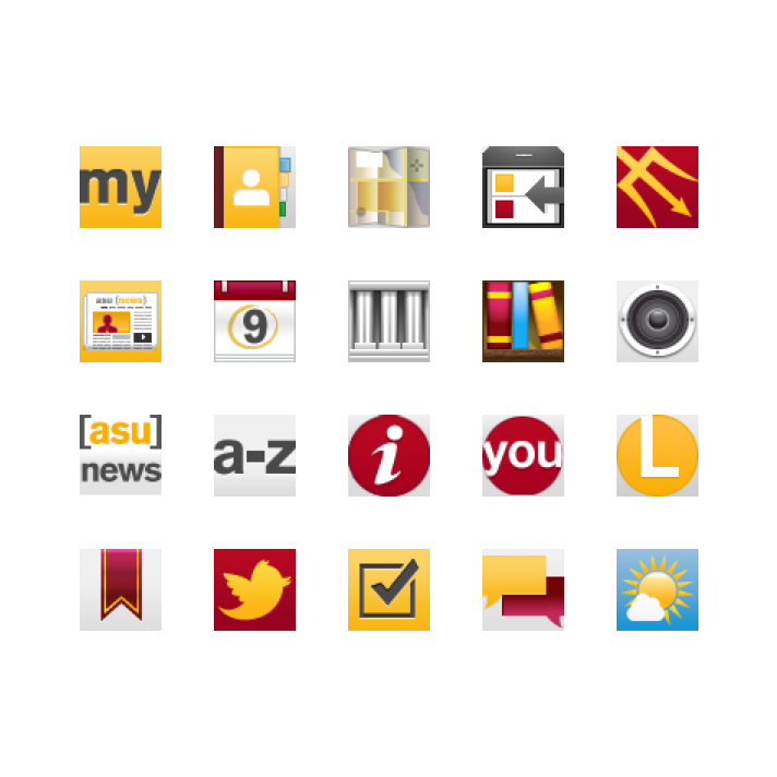
In the Web/UI gallery I mentioned how I got to design the mobile optimized version of ASU's homepage. In addition to the design, I crafted the icons as well.

I know what you're thinking: these aren't icons, they're spot illustrations. I agree, but I wanted to include them anyway. 😊

Paper Napkin Designs
2008–2010
Bolstered by the desire to design and build websites that weren’t university-related, a few of my fellow friends and ASU co-workers founded an LLC called Paper Napkin Designs. We freelanced outside of work and built Drupal sites for clients like law firms and even the Maricopa Democratic Party. I got to do all things design, which included coming up with Paper Napkins’ visual identity. And what is a brand without its own bespoke iconography?
The logo for Paper Napkin Design was a bit too on the nose, and we often had to accompany it with the subtitle ‘A Web Design Company.’ I used the Avenir and Lobster typefaces throughout its identity.”
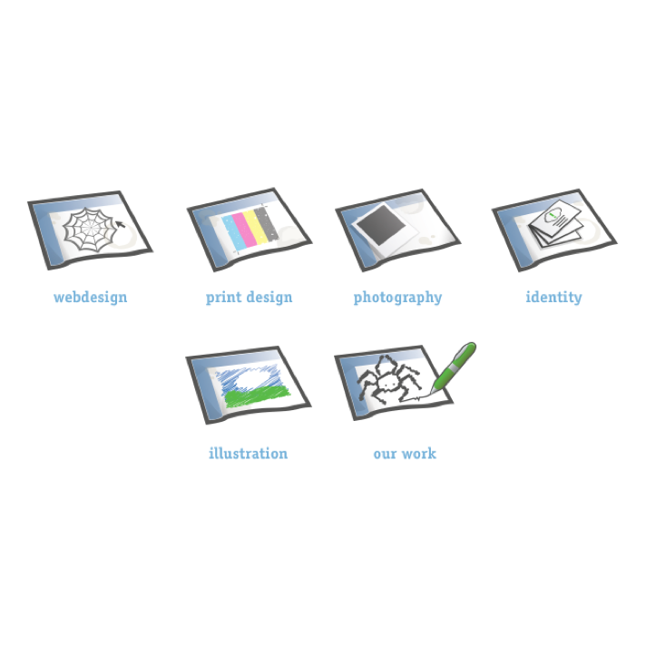
Our design services were represented as paper napkin doodles (except for identity which just had a stack of business cards atop a napkin).

Design, Build, and Manage were the services we provided to prospective clients. As time went on we created a fun little spider mascot and started using the phrase "we spin web".
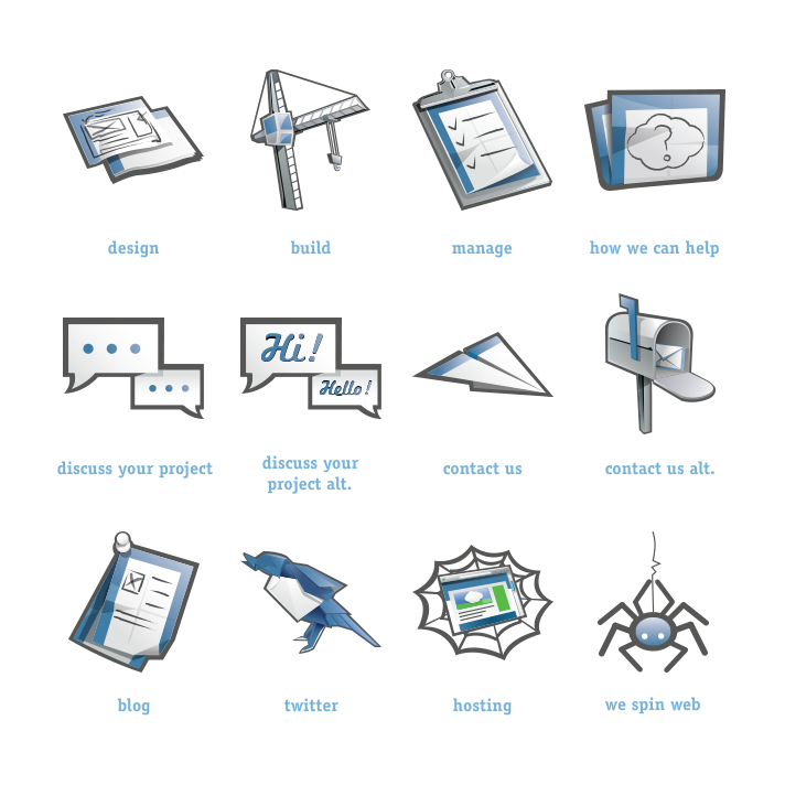
Site navigation and page titles were also represented as icons.

We also represented our hosting tiers with iconography. You'd be surprised by how fun it is to illustrate a server rack — I'd highly reccomend giving it a try.

Meltmedia
2011–2014
Back when I worked at ASU I began building my first icon set. Inspired by hlvticons I wanted to design icons that would work with the FF Meta typeface, or at least that's how it started. As time went on I just kept adding to the set whenever an idea for a icon would pop into my head. Other times I'd make an icon based off an existing one to see how my version would look like. Eventually I collected some of my favorites and put them up for free on Meltmedia's blog.
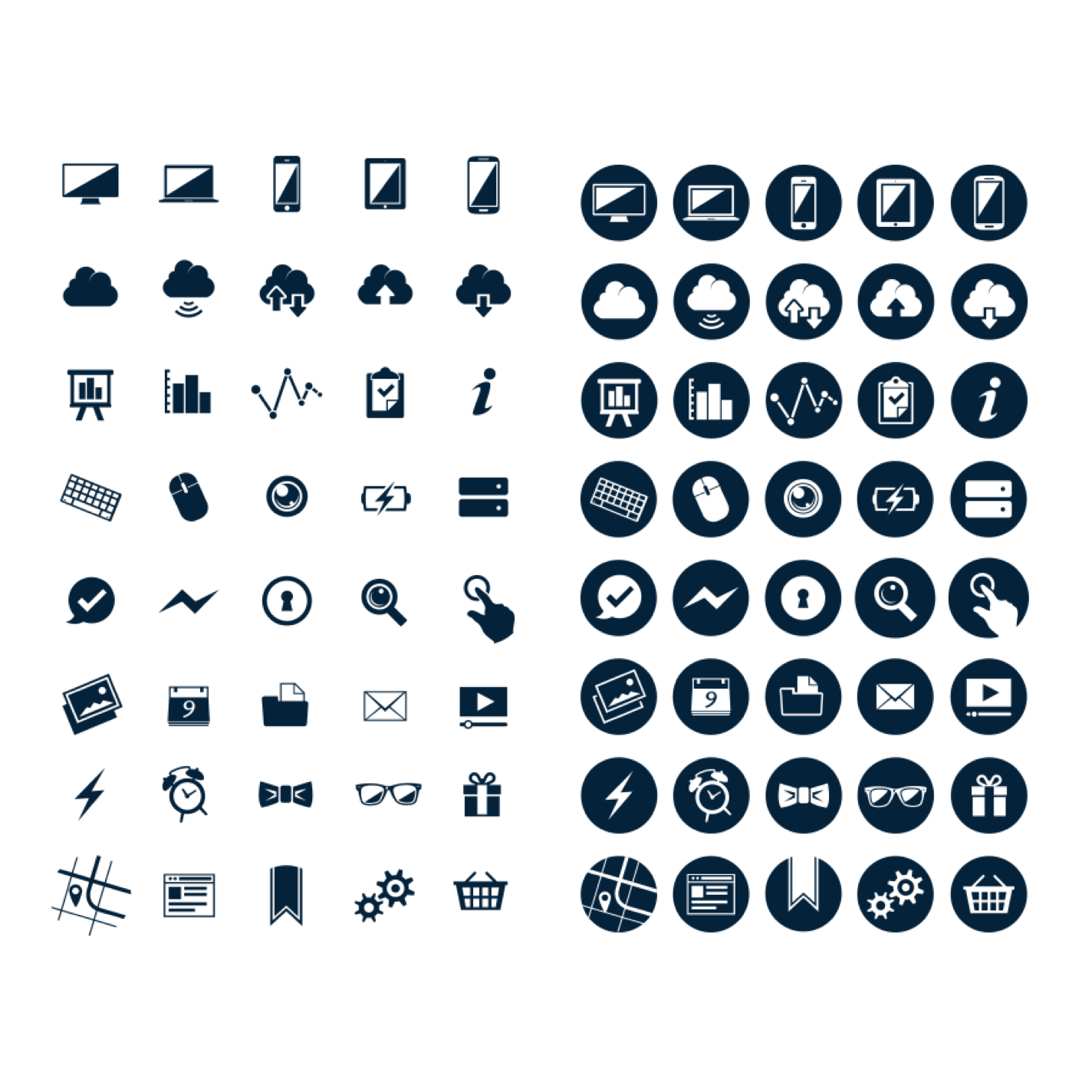
I actually ended up offering two sets off the metlmedia blog. The second set were exported out as ligatures and came in two variants: regular and encircled.
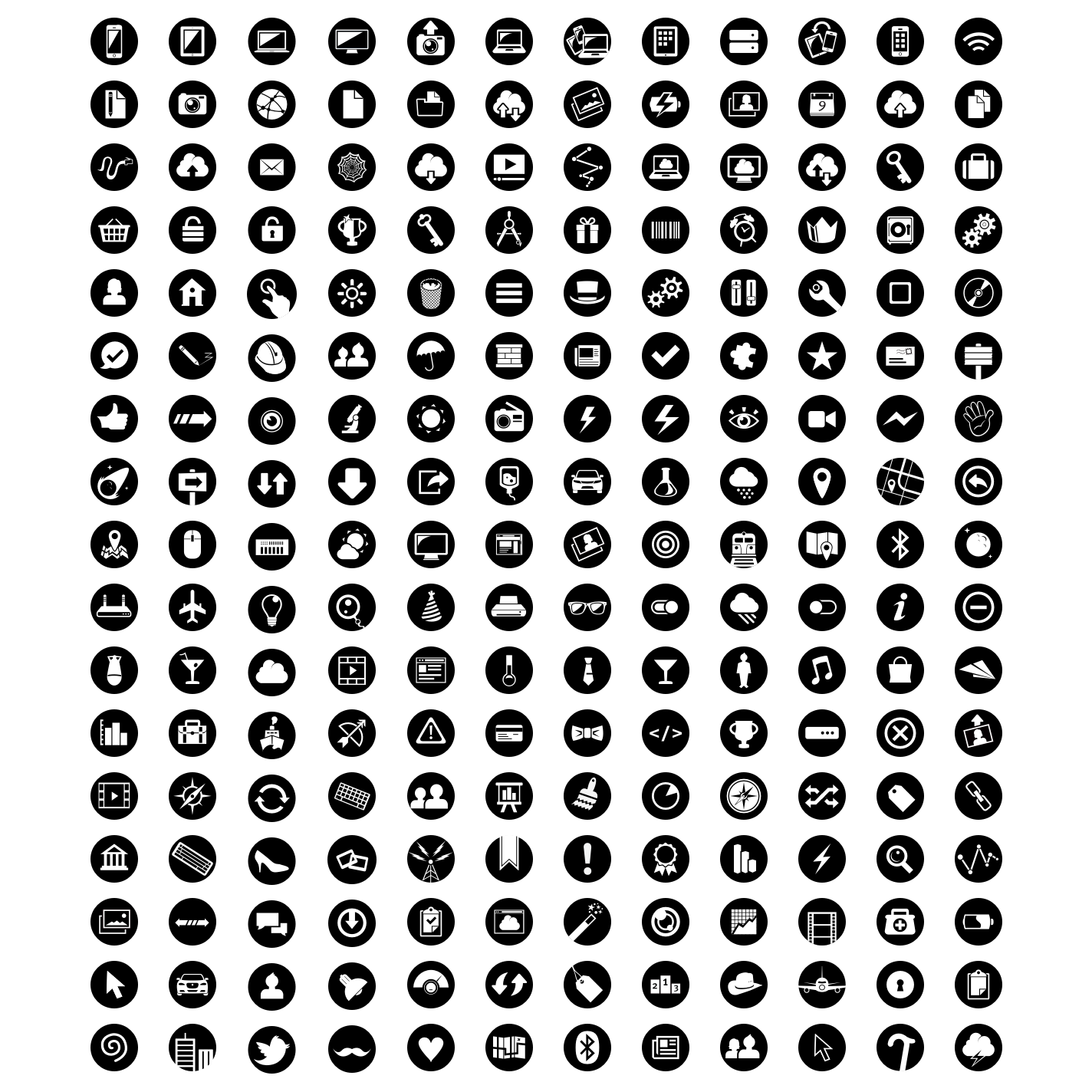
This is entire set. Back then I wasn't as concerned about consistency or thematic unity — I just wanted to draft icons.

For every release I'd design a little blog illustration. Can you guess which set came out after iOS 7?

Guidebook
2015–2020
I have a whole case study about the icon set I built for guidebook. In it I go over the creation of icon variants, like the red, green, blue, and even the mono chromatic one...but you have all been deceived for another variant was forged in secret. Or at least I didn't mention it in the case study because it wasn't a full variant, only certain icons were given what I called "the hollow" treatment.

Hollow icons were reserved for the Guidebook apps and the Builder CMS. Initially for empty states, the idea was that line icons are unfilled on the inside inferring that the feature too was unfinished until our users put their content in.
Continuing with the unfinished motif, the hollow icons were also used for the templates our users could use when building out their guides. The Icons placed in the circles were used to represent template categories (audio tours, governance, workplace, etc.) and the ones placed in rectangles were placeholder guide covers.

Each template also had a banner graphic. I choose the icons that corresponded with the template features, and then composed them in a repeatable patterns. The crossed and dots were fun little bits included to add in some whimsey.

On the builder site, the hollow icons needed a little fleshing out. Empty states were given an interior gray fill, and when active, low contrast color fills were used. Since the line icons were set in a 1pt stroke, they couldn’t be sized down without looking fuzzy, so each had a lower resolution version.
Most of these hollow icons were variations of the Guidebook icon set, but there were exceptions. Icons representing guide plans and product types were designed in the same hollow style but lacked corresponding Guidebook icon counterparts. These icons were made in large, medium, and small sizes (enlarged to show texture).

The newspaper Guidebook icon running through all it's variants, including hollow.

Guiller.me
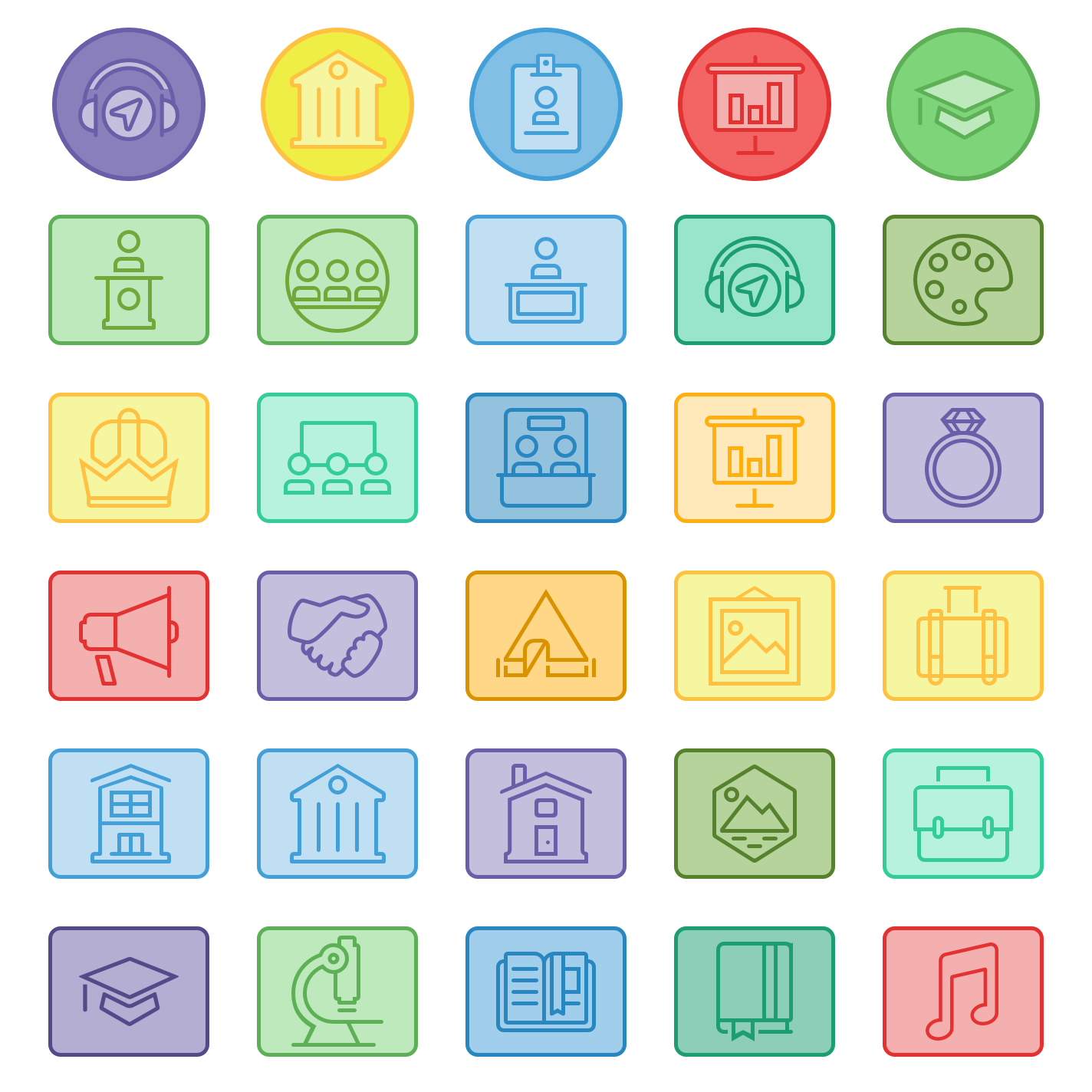
Have you noticed all the iconography across this site? After redesigning my logo, I figured an icon set should go along with it. Originally, each icon was meant to represent sections in my case studies, but, well… I couldn’t help myself and kept going. Grab them if you like them!
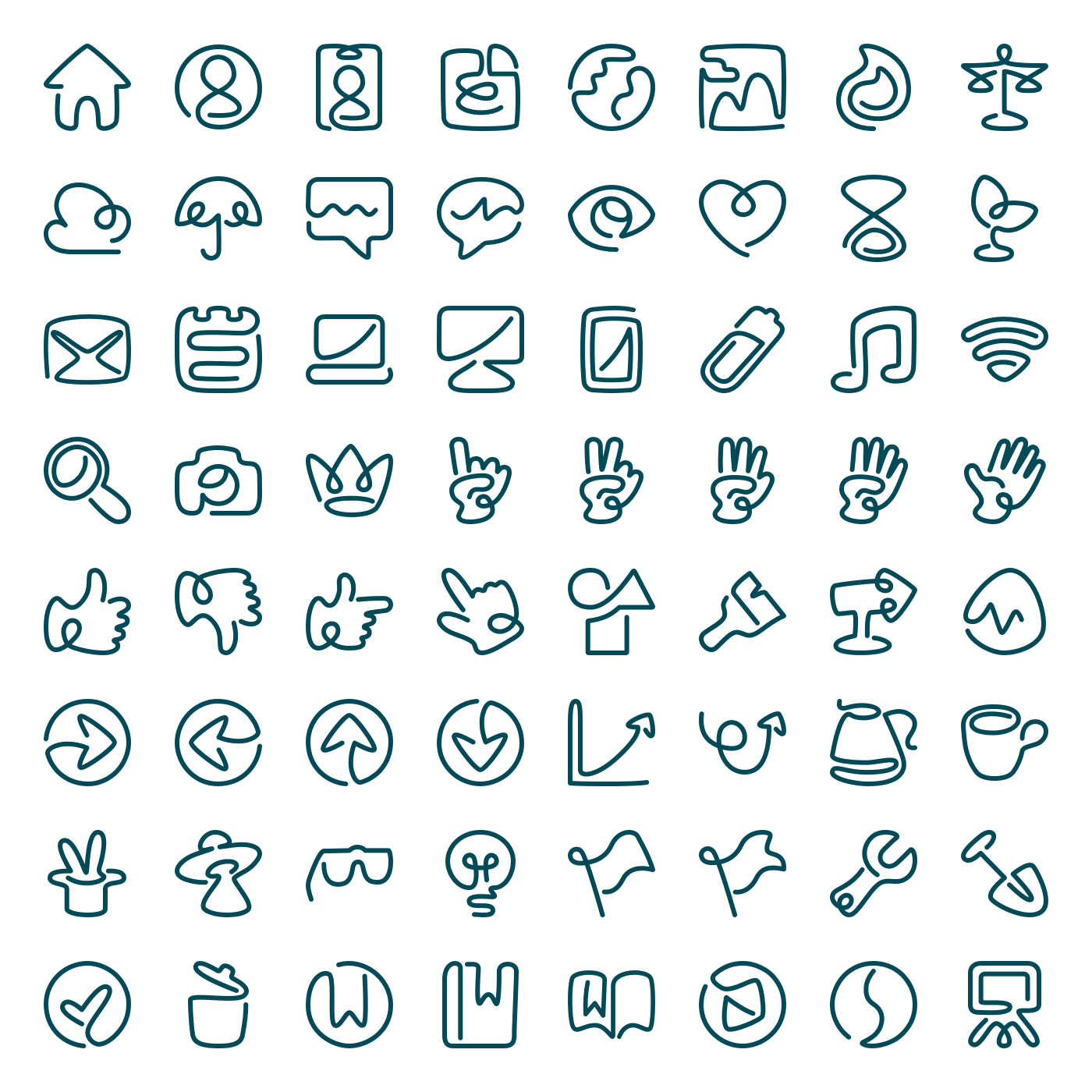
The challenge with this set was building each icon out of a single continuous line. I also used loops, occasional overlaps, and organic curves to tie back the style of my logo. Straight lines were only used when necessary.

Lately my daughter’s been really into sticker sheets, so I figured I’d make her one. I used my icon set as the foundation. They're not all colorized yet, but I’ve been adding to the set little by little.
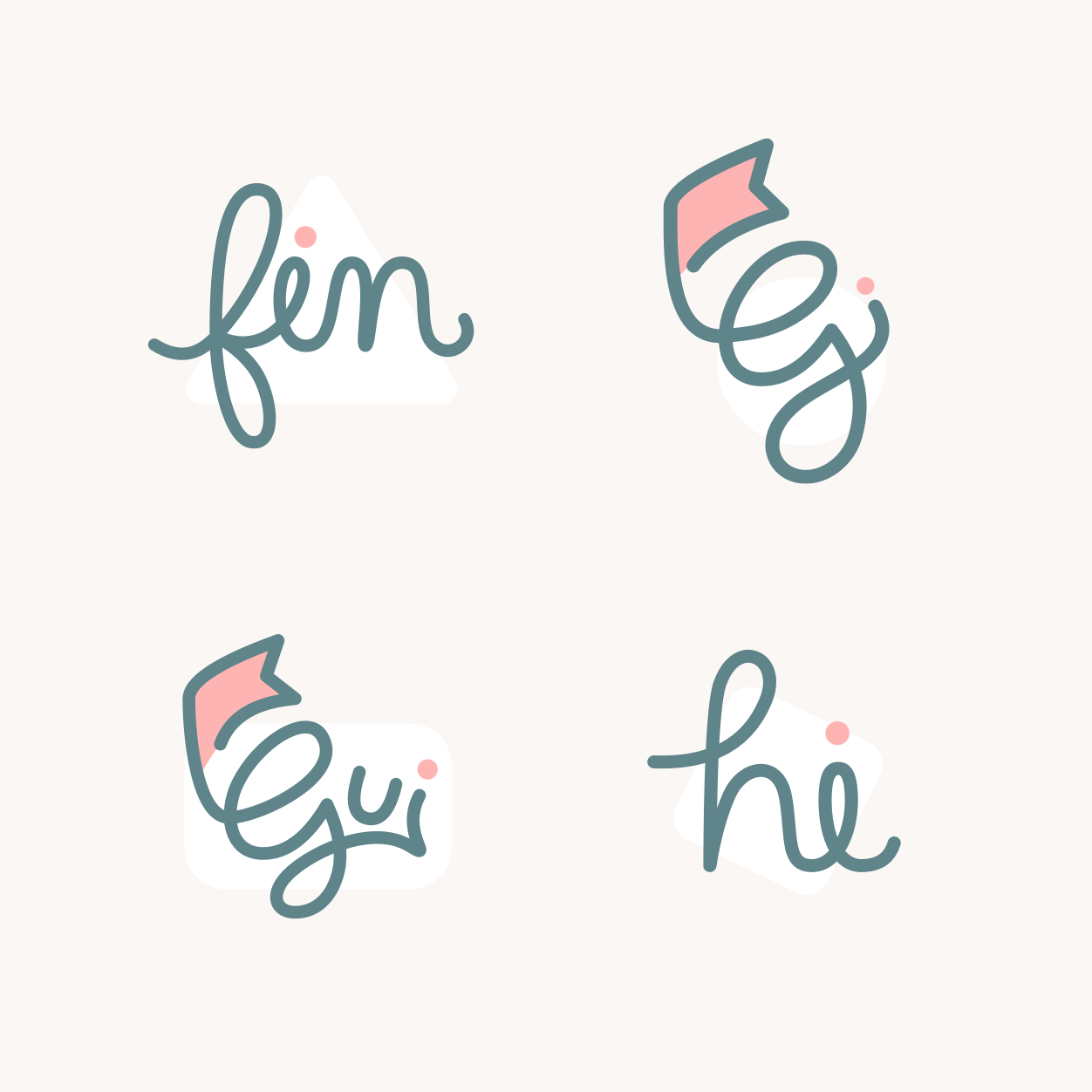
You've seen my logo and the "fin" graphic, but I had a couple other ones that didn't make the cut. The "gui", was intended to be used as footer graphic, but I decided to use my logo instead. The "hi" was orginigally used at the top of my homepage, but I went with my hand wave icon instead.


